1. Introduction
Flexa applications allow end-users to configure device settings through a web-based UI. Rather than building this UI by hand for every application, Barix provides a declarative approach: you describe your settings in a JSON file — the Settings Definition File (SDF) — and the Flexa platform renders the corresponding form automatically.
This guide explains the SDF format in detail, shows practical examples for each building block, and points you to the SDF Playground where you can author and test your files interactively.
1.1 What is an SDF?
SDF stands for Settings Definition File. It is a JSON file that acts as a form blueprint: it declares what settings exist, how they should be displayed, what values they accept, and how they relate to each other. The Flexa UI reads this file and generates a fully functional configuration form — no front-end coding required.
1.2 The SDF Playground
Barix provides an online playground where you can paste or write an SDF and instantly see the rendered form:
👉 http://sdf-playground.s3-website.eu-north-1.amazonaws.com/
Use it to prototype and iterate quickly before shipping your SDF.
💡 Tip: The Playground gives you live feedback. If the form doesn't look right, check the browser console for JSON parsing errors
2. Package Structure & File Location
The sdf.json file must live inside a directory named config at the root of your Flexa Package. The filename must be exactly sdf.json — no other name is accepted.
myapp/
├── config/
│   └── sdf.json        ← your Settings Definition File
├── manifest.json
├── install.json
└── main.py
⚠️ Important: If
sdf.jsonis missing, incorrectly named, or placed outside theconfig/directory, the Flexa platform will not render a configuration form for your app.
To make the Flexa app “sdf aware,” the install.json must include the sdf object pointing to the directory containing the sdf.json file within the flexa package.
{
    "scripPath": "main.py",
    "run": "python3 main.py",
    "minFwVersion": "2.3.0",
    "name": "TCP_COMMAND_API",
    "files": [
    ],
    "sdf": {
        "file": "config/sdf.json",    <- Path of sdf.json within the package
        "tabName": "TCP API"
    }
}
The “tabName” parameter will be the name of the TAB randered in the web UI. For the above example:
3. Form Submission Behaviour
When a user fills in the form and clicks Submit, two things happen automatically:
-
config.jsonis generated or updated — Flexa writes the resulting configuration values to a file namedconfig.jsonat the root of your package directory. This is the file your application reads at runtime to obtain its configuration. -
The Flexa App restarts — the app is restarted automatically so it picks up the new
config.jsonimmediately. No manual restart is needed.
myapp/
├── config/
│   └── sdf.json        ← defines the form
├── config.json         ← generated/updated on each form submission
├── manifest.json
├── install.json
└── main.py
Your application code should therefore read its configuration from config.json at the package root on startup. All values are nested inside a top-level "AppParam" object, regardless of how your SDF is structured. The keys inside it mirror the key fields you defined in your SDF params.
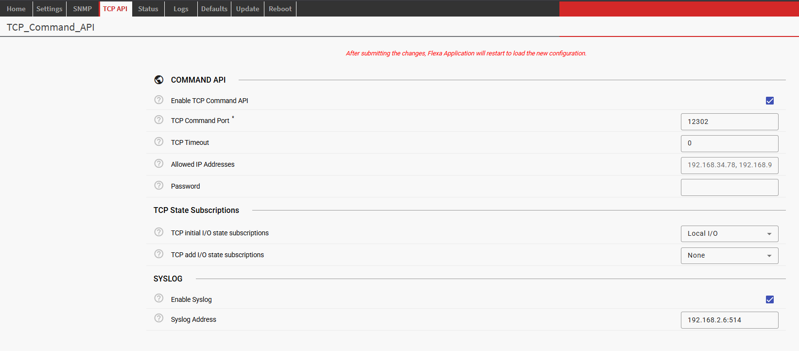
Example config.json created by a form generated using sdf (from the TCP Legacy API Flexa App):
{
    "AppParam": {
        "TCP_api_enable": true,
        "TCP_port": 12302,
        "TCP_timeout": 0,
        "allowed_ips": "",
        "password": "",
        "TCP_initial_state_subscriptions": "LocalIO",
        "TCP_add_IO_state_subscriptions": "None",
        "enable_syslog": true,
        "syslog_address": "192.168.2.6:514"
    }
}
⚠️ Important: Always read your configuration from
config["AppParam"]in your application code — accessing the root object directly will not give you the parameter values.
💡 Tip: Because the app restarts on every submission, make sure your app handles a clean startup gracefully — avoid assuming any in-memory state persisted from a previous run.
4. Top-Level Structure
Every SDF file is a JSON object with two top-level keys:
{
  "config": [ /* array of Content objects */ ],
  "scopes": [ /* array of Scope objects — reserved for future use */ ]
}
|
Key |
Type |
Required |
Description |
|---|---|---|---|
|
|
Content[] |
Yes |
The ordered list of items that make up the form. Each item is a Content object (Section, Param, or Division). |
|
|
Scope[] |
No |
Reserved for future use. Define named scopes here for advanced cross-parameter validation. Pass an empty array for now. |
5. Content Objects
Every element that appears in the form is a Content object. A Content object always has exactly two keys:
{
  "c_type": "section" | "param" | "division",
  "c_data":  <Section object> | <Param object> | <Division object>
}
|
|
What it renders |
|
|---|---|---|
|
|
An expandable panel grouping related fields |
Section object |
|
|
A single configurable field (text box, toggle, dropdown…) |
Param object |
|
|
A visual horizontal divider with an optional label |
Division object |
6. Sections
A Section groups related parameters under an expandable panel. Sections can be nested — a section's content can itself contain other sections.
6.1 Section Fields
|
Field |
Type |
Required |
Description |
|---|---|---|---|
|
|
string |
Yes |
The text displayed in the section header. |
|
|
string |
Yes |
A unique identifier for this section. Used as a namespace key in the resulting JSON output. Params inside a section are written to |
|
|
Content[] |
Yes |
The items inside the section: a mix of Params, sub-Sections, or Divisions. |
|
|
string |
No |
A Material Icon code to display next to the label (e.g. |
|
|
boolean |
No |
Whether the section starts expanded. Defaults to |
|
|
boolean |
No |
When |
6.2 Example
A collapsible "Network" section containing two parameters:
{
  "config": [
    {
      "c_type": "section",
      "c_data": {
        "label": "Network",
        "key": "network",
        "icon": "wifi",
        "panelOpenState": true,
        "content": [
          {
            "c_type": "param",
            "c_data": {
              "label": "IP Address",
              "key": "ip_address",
              "var_type": "string",
              "type": "text",
              "type_properties": {
                "widget": "input",
                "regexp": "^\\d{1,3}(\\.\\d{1,3}){3}$"
              },
              "default_value": ""
            }
          },
          {
            "c_type": "param",
            "c_data": {
              "label": "Port",
              "key": "port",
              "var_type": "number",
              "type": "number",
              "type_properties": {
                "widget": "input",
                "min": 1,
                "max": 65535
              },
              "default_value": 12345
            }
          }
        ]
      }
    }
  ],
  "scopes": []
}
7. Parameters (Params)
A Param is the core building block of any SDF. It maps a single user-facing form field to a key in the resulting configuration JSON.
7.1 Common Param Fields
|
Field |
Type |
Required |
Description |
|---|---|---|---|
|
|
string |
Yes |
The field label shown to the user. |
|
|
string |
Yes |
The output key written to the resulting JSON configuration. |
|
|
string |
Yes |
The data type of the stored value. See Section 7.2. |
|
|
string |
Yes |
The UI widget category. See Section 7.3. |
|
|
object |
Yes |
Widget-specific configuration. See Section 7.3. |
|
|
string |
No |
A short hint shown on hover. |
|
|
string |
No |
Markdown-formatted help text shown in a help panel. Falls back to |
|
|
string |
No |
Placeholder text shown inside an empty input field. |
|
|
boolean |
No |
When |
|
|
any |
No |
The value pre-filled in the field. Must match the |
|
|
array |
No |
Conditionally reveal other content based on this param's value. See Section 8. |
|
|
boolean |
No |
If |
|
|
string |
No |
Associates this param with a named scope (see |
7.2 Variable Types (var_type)
var_type declares the data type of the value stored in the output JSON.
|
|
Description |
Typical UI type |
|---|---|---|
|
|
Plain text: names, URLs, email addresses, etc. |
|
|
|
Integer or decimal number. |
|
|
|
True / false value. |
|
|
|
An ordered list of strings (multi-select). |
|
|
|
An ordered list of numbers (multi-select). |
|
|
|
An ordered list of heterogeneous objects. |
|
7.3 UI Types and their type_properties
The type field chooses the widget category. Each type expects specific keys inside type_properties.
7.3.1 text
Renders a single-line text input. Use this for strings such as hostnames, email addresses, or any value that needs format validation via a regular expression.
|
Property |
Required |
Description |
|---|---|---|
|
|
Yes |
Must be |
|
|
Yes |
A regular expression string used to validate the value. The form blocks submission when validation fails. |
Example — hostname field:
{
  "label":       "Hostname",
  "key":         "hostname",
  "var_type":    "string",
  "type":        "text",
  "tooltip":     "The device hostname (letters, digits, hyphens only)",
  "placeholder": "my-device",
  "required":    true,
  "type_properties": {
    "widget": "input",
    "regexp": "^[a-zA-Z0-9-]+$"
  }
}
7.3.2 password
Identical to text but the entered value is masked. Use for secrets, API keys, and passwords.
{
  "label":    "API Secret",
  "key":      "api_secret",
  "var_type": "string",
  "type":     "password",
  "required": true,
  "type_properties": {
    "widget": "input",
    "regexp": ".+"
  }
}
7.3.3 number
Renders either a numeric text input or a slider. Use this for all numeric settings such as volumes, timeouts, and port numbers.
|
Property |
Required |
Description |
|---|---|---|
|
|
Yes |
|
|
|
No |
Minimum accepted value. |
|
|
No |
Maximum accepted value. |
|
|
No |
Stepping interval (e.g. |
|
|
No |
Unit label displayed next to the field (e.g. |
|
|
No |
Slider only. Shows the numeric value label on the thumb. Default: |
|
|
No |
Slider only. Shows tick marks along the track. Default: |
Example — volume slider (0–100 dB):
{
  "label":         "Output Volume",
  "key":           "volume",
  "var_type":      "number",
  "type":          "number",
  "default_value": 80,
  "type_properties": {
    "widget":        "slider",
    "min":           0,
    "max":           100,
    "step":          1,
    "units":         "dB",
    "discrete":      true,
    "showTickMarks": false
  }
}
7.3.4 boolean
Renders a checkbox. The stored value is true or false.
⚠️ Note: When
requiredis set totruefor a boolean param, the checkbox must be checked for the form to be valid. This is useful for consent or acknowledgement fields.
{
  "label":         "Enable Streaming",
  "key":           "streaming_enabled",
  "var_type":      "boolean",
  "type":          "boolean",
  "default_value": false,
  "type_properties": {
    "widget": "checkbox"
  }
}
7.3.5 selection
Renders a dropdown (or multi-select dropdown when var_type is string[] or number[]). You define the list of options explicitly.
|
Option field |
Required |
Description |
|---|---|---|
|
|
Yes |
The raw value stored in the configuration. |
|
|
Yes |
The human-readable label shown in the dropdown. |
|
|
No |
A tooltip shown when hovering this option. |
|
|
No |
Always disables this option. |
|
|
No |
Conditionally disables the option. Requires |
Example — audio codec selection:
{
  "label":    "Audio Codec",
  "key":      "codec",
  "var_type": "string",
  "type":     "selection",
  "required": true,
  "type_properties": {
    "widget": "select",
    "options": [
      { "value": "mp3",  "label": "MP3" },
      { "value": "aac",  "label": "AAC" },
      { "value": "opus", "label": "Opus", "tooltip": "Best for low-latency" },
      { "value": "pcm",  "label": "PCM (uncompressed)", "disabled": true }
    ]
  }
}
7.3.6 list
Renders a dynamic list of identical sub-forms. Each item in the list is itself a set of Content objects, allowing the user to add, remove, and reorder structured entries.
|
Property |
Required |
Description |
|---|---|---|
|
|
Yes |
Array of Content objects that define the fields for each list item. |
|
|
No |
Maximum number of items the user may add. |
|
|
No |
Minimum number of items required. (Not yet implemented.) |
|
|
No |
Number of empty items shown on load. (Not yet implemented.) |
Example — list of audio stream destinations:
{
  "label":    "Stream Destinations",
  "key":      "destinations",
  "var_type": "any[]",
  "type":     "list",
  "type_properties": {
    "max_items": 4,
    "config": [
      {
        "c_type": "param",
        "c_data": {
          "label": "URL", "key": "url", "var_type": "string",
          "type": "text",
          "type_properties": { "widget": "input", "regexp": "^https?://.+" }
        }
      },
      {
        "c_type": "param",
        "c_data": {
          "label": "Port", "key": "port", "var_type": "number",
          "type": "number",
          "type_properties": { "widget": "input", "min": 1, "max": 65535 }
        }
      }
    ]
  }
}
8. Conditional Content
The conditional field lets you show or hide additional Content objects depending on the current value of a Param. This keeps the form clean — only relevant settings are visible at any given time.
8.1 How it works
Add a conditional array to any Param. Each entry specifies one or more match conditions and a config list of Content objects to reveal when those conditions are met.
"conditional": [
  {
    "when_value_is": ["udp", "tcp"],
    "config": [
      {
        "c_type": "param",
        "c_data": { "label": "Remote IP", "key": "remote_ip", ... }
      }
    ]
  }
]
⚠️ Important: Conditional content is inserted into the same parent as the param that owns the conditional. If two conditions can be active simultaneously, make sure all their child param keys are unique to avoid collisions.
8.2 Condition Keys
|
Condition key |
Applicable |
Description |
|---|---|---|
|
|
any |
Show when the value equals one of the listed values. |
|
|
any |
Show when the value does not equal any of the listed values. |
|
|
number |
Show when the value is greater than the given number. |
|
|
number |
Show when the value is less than the given number. |
|
|
number |
Show when the value is greater than or equal to the given number. |
|
|
number |
Show when the value is less than or equal to the given number. |
|
|
string, number |
Show when the value starts with one of the listed prefixes. |
|
|
string, string[], number |
Show when the value contains one of the listed substrings or items. |
|
|
string |
Show when the value matches one of the listed regular expressions. |
8.3 Example — Protocol-dependent fields
A transport protocol selector reveals different sub-settings depending on the chosen protocol:
{
  "c_type": "param",
  "c_data": {
    "label":    "Transport Protocol",
    "key":      "protocol",
    "var_type": "string",
    "type":     "selection",
    "required": true,
    "type_properties": {
      "widget":  "select",
      "options": [
        { "value": "udp",  "label": "UDP"  },
        { "value": "tcp",  "label": "TCP"  },
        { "value": "http", "label": "HTTP" }
      ]
    },
    "conditional": [
      {
        "when_value_is": ["udp", "tcp"],
        "config": [
          { "c_type": "param", "c_data": {
              "label": "Remote Host", "key": "remote_host",
              "var_type": "string", "type": "text",
              "type_properties": { "widget": "input", "regexp": ".+" }
          }}
        ]
      },
      {
        "when_value_is": ["http"],
        "config": [
          { "c_type": "param", "c_data": {
              "label": "Endpoint URL", "key": "http_url",
              "var_type": "string", "type": "text",
              "type_properties": { "widget": "input", "regexp": "^https?://.+" }
          }}
        ]
      }
    ]
  }
}
9. Divisions
A Division is a visual horizontal rule that separates groups of parameters within a section. It helps the user navigate long forms without introducing a new expandable panel.
{
  "c_type": "division",
  "c_data": {
    "label": "Advanced Settings",
    "icon":  "tune"
  }
}
|
Field |
Required |
Description |
|---|---|---|
|
|
Yes |
Text displayed alongside the divider. |
|
|
No |
A Material Icon code to display next to the label. |
10. Complete Example
The following SDF defines a realistic audio streaming configuration form with two sections, several param types, and a conditional:
{
  "config": [
    {
      "c_type": "section",
      "c_data": {
        "label": "General",
        "key":   "general",
        "icon":  "settings",
        "content": [
          {
            "c_type": "param",
            "c_data": {
              "label":       "Device Name",
              "key":         "device_name",
              "var_type":    "string",
              "type":        "text",
              "required":    true,
              "placeholder": "My Barix Device",
              "type_properties": { "widget": "input", "regexp": ".+" },
              "default_value": "Barix"
            }
          },
          {
            "c_type": "param",
            "c_data": {
              "label":         "Enable Streaming",
              "key":           "streaming_enabled",
              "var_type":      "boolean",
              "type":          "boolean",
              "default_value": true,
              "type_properties": { "widget": "checkbox" }
            }
          }
        ]
      }
    },
    {
      "c_type": "section",
      "c_data": {
        "label": "Audio",
        "key":   "audio",
        "icon":  "volume_up",
        "content": [
          {
            "c_type": "param",
            "c_data": {
              "label":         "Output Volume",
              "key":           "volume",
              "var_type":      "number",
              "type":          "number",
              "default_value": 80,
              "type_properties": {
                "widget": "slider", "min": 0, "max": 100,
                "step": 1, "units": "dB", "discrete": true
              }
            }
          },
          {
            "c_type": "param",
            "c_data": {
              "label":    "Codec",
              "key":      "codec",
              "var_type": "string",
              "type":     "selection",
              "required": true,
              "type_properties": {
                "widget": "select",
                "options": [
                  { "value": "mp3",  "label": "MP3"  },
                  { "value": "aac",  "label": "AAC"  },
                  { "value": "opus", "label": "Opus" }
                ]
              },
              "conditional": [
                {
                  "when_value_is": ["mp3"],
                  "config": [
                    { "c_type": "param", "c_data": {
                        "label": "Bitrate (kbps)", "key": "mp3_bitrate",
                        "var_type": "number", "type": "selection",
                        "type_properties": {
                          "widget": "select",
                          "options": [
                            { "value": 128, "label": "128 kbps" },
                            { "value": 192, "label": "192 kbps" },
                            { "value": 320, "label": "320 kbps" }
                          ]
                        }
                    }}
                  ]
                }
              ]
            }
          }
        ]
      }
    }
  ],
  "scopes": []
}
This sdf configuration, after submitting from the UI tab, produces the following config.json :
{
    "AppParam": {
      "general": {
        "device_name": "Barix",
        "streaming_enabled": true
      },
      "audio": {
        "volume": 80,
        "mp3_bitrate": 128,
        "codec": "mp3"
      }
    }
}
11. Quick Reference
11.1 Choosing the right type
|
Use case |
|
|
|
|---|---|---|---|
|
Free-form text, URL, hostname |
|
|
|
|
Secret / password |
|
|
|
|
Integer or decimal |
|
|
|
|
Range with a visual slider |
|
|
|
|
Yes / no toggle |
|
|
|
|
Single choice from a list |
|
|
|
|
Multiple choices from a list |
|
|
|
|
Repeating structured items |
|
|
(n/a) |
11.2 Mandatory fields at a glance
|
Object |
Mandatory fields |
|---|---|
|
Root |
|
|
Content |
|
|
Section |
|
|
Param |
|
|
Division |
|
|
Scope |
|
12. Tips & Best Practices
✅ Use the Playground first. Paste your SDF into the Playground before integrating it into your app. It catches structural errors instantly.
✅ Keep keys unique across siblings. Param keys must be unique within the same parent. When conditionals bring in extra params, verify their keys don't clash with sibling params — especially when multiple conditions can be active at the same time.
✅ Always provide a default_value for optional fields. Users shouldn't have to fill in every field from scratch. Supply sensible defaults to reduce friction and mistakes.
✅ Use tooltip and help together. tooltip gives a one-line hint on hover. help allows full Markdown — use it for longer explanations, links to documentation, or example values.
✅ Prefer selection over free text where possible. Offering a fixed set of valid values reduces misconfiguration errors compared to an open text field with a complex regex.
⚠️
scopesare not yet implemented. Include it as an empty array ("scopes": []) to keep your SDF forward-compatible.